Friday, June 11, 2010
Tuesday, March 16, 2010
Body Mechanics Evolution Reel
way back when i was learning the art of animation, it was just the hook&play of softwares which made the animation easy,every one depended up on computers,but now i pop out of my neck and should say that its not just computers&softwares but the "state of the art of animation",so then i know how to animate but donno ways to animate, iwas not having a cultured way of animating,
but now ican say that i know the way to animate and make it beleivable to eyes,thats because of the animation gurus keithlango &jason ryan thanks to them and the video i published here is about the evolution process of the bodymechanics. that scene is from kungfu panda i liked it a lot and thought of enjoying animating the scene,and i did it ,it includes the step by step process of animation from story telling poses to final animation,i hope that will be useful to some you guys..ok thats it for now
i hope iwill post some good stuff next time which im doing with boris rig its totally snappy and ed,edd and eddiesh stuff the work is in progress...ok bye for now
happy animating!
Friday, December 18, 2009
''BOO HELLO'
guys if u arent aware of it, go check tat out, its a wonderful cartoon. ahh, and one thing i did this in 12 frames per second to get that linear cartoon feel...
Tuesday, December 15, 2009
3D ANIMATOR
I hope i could some how manage it in to 3d animation,if u observe u can see more holds in the animation,ofcourse being a lango lad ihave to do that....
Sunday, November 22, 2009
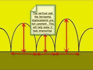
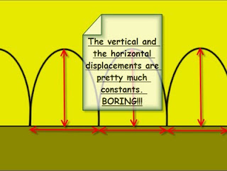
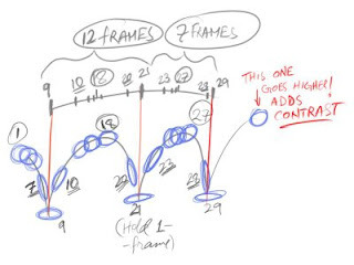
Spontaneous Life : Timing tip
Monday, November 9, 2009
Plussing in spite of limitations
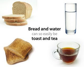
A lot of animators on high footage projects (DVD, games, TV, commercials, etc.) often complain about the limitations of time and budget. And true enough, those limitations do exist. You only have so many dollars, so many days and so many animators. You're often not given a lot to work with. But then it's up to the animator to think outside the box. What one added ingredient or what one change in the way you present the scene would make the simple and plain into something pleasing and satisfying? After all the only difference between bread and toast is a little heat and some butter. What can you add to your scene to elevate it from bread & water into tea & toast?
Imagination vs. Knowledge
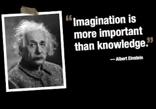
Imagination is more important than knowledge. For knowledge is limited to all we now know and understand, while imagination embraces the entire world, and all there ever will be to know and understand.
Thursday, November 5, 2009
PLUSSING-FACES
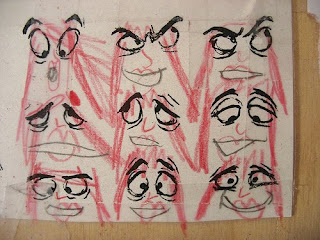

Walt Disney coined the term plussing as a way of making an idea even better. By telling his workers to plus it, even when they think they nailed it, gave Disney that extra edge when it came to quality animation back in the day. Pixar is a staunch believer in plussing their work. And it shows. So, in the case of my dear Ava, back in October she had already added her touch to these eyes that I have taped up on my desk at work which were copied from the animation tome, The Illusion of Life. Just the other day I looked up and saw that she's since plussed them, adding noses, lips and hair. I sense a future Pixar employee, folks.
Monday, October 5, 2009
LOONEY TOONS
 Over the last few weeks, I’ve been step-framing through my Looney tunes This stuff is a gold mine! You can pick any golden age WB cartoon at random, and learn a ton from it.
Here are a few things I picked up. I’m using a clip from Clampett’s "Tortoise Wins by a Hare" as an example here.Note: Images for educational purpose only.
LOONEY LESSON #1: DYNAMIC BALANCE
It’s great to see how far they pushed a character’s pose and line of action while still making them look balanced. Keep the hips above the feet, and the rest of the body can really be pushed out there!
LOONEY LESSON #2: RHYTHM & FLOW
Rhythm and flow are a little harder to understand and explain. It’s a deeper subject — I’m still trying to absorb these concepts. I know one thing: the following poses are just dripping with them.
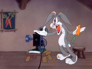
There’s a graceful, almost effortless visual rhythm as your eye moves around the pose.
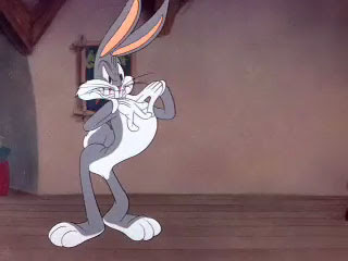
The feet, ears or hands are not pointing the same way — or as Keith would say, "playing the same note" — yet they work together and the pose is cohesive.
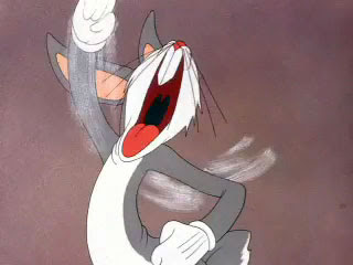
Don’t be deceived by the simplicity of this pose. All the good stuff they teach in life drawing is on display here — composition, silhouette, negative space, tension, and of course, rhythm and flow.
In other words, controlled movement. When you’re trying to pull off a crazy, over-the-top movement, anchor some part of the pose to avoid turning your animation into noise. Of course, the part that’s moving around still needs to have good spacing and arcs, but limiting the movement on part of the character helps a lot. Here’s an unusual and brilliant example: The anchored parts (the feet) aren’t on the ground — it’s quite the opposite.

There’s a lot more to learn from these old classics. I’m just beginning to scratch the surface, and I highly recommend this sort of study! Now that some of these cartoons are available on the iTunes store for a buck a piece, it’s great because you can study the clips at 24 fps and see the original timing. You don’t even have to leave the comfort of your computer.*
Although seriously, do leave the comfort of your computer from time to time. Try it. Get up and move around. Now. This blog will still be here when you get back
Friday, October 2, 2009
ANIMATRICS WORKFLOW
Few basics
Key Poses:Key poses or the storytelling poses define the character, the emotion, the feeling of the moment, the energy, and the performance. These poses or drawings are the soul of your scene, or they are the bedrock to your scene.
Primary Breakdowns:Primary breakdowns define three major elements of motion....1) Favoring (what is favoring?? Oh! You're not sure about it? Go ahead and read Keith's "Do Me A Favor" tutorial....awesome stuff!)
2) Overlap and Drag (Wanna learn more about them in a detail? Read Keith's "Breakdowns Can Be Such a Drag" overlaping motion article.
3) Arcs (Do NOT ignore them! They are really improtant to create a good looking animation....)
Secondary Breakdowns:Secondary breakdowns help you define the motion even more. When a primary breakdown is not enough for the computer to interpolate properly, you add a secondary breakdown, kinda like fill in the blanks, to further define the motion. It helps to define eases, additional overlap, micro anticipations, additional arc definition, overshoot, settle, etc...
Close your eyes and ANIMATE..
(thinking/planning and drawing...):
Okay, you can now close your eyes and imagine your scene..... Just imagine your character in action... and try to see the scene already done. Visualize what the core of the scene is.Also, you may wanna create and/or find reference, act the scene out....make thumbnails and share your ideas with others. This step is really improtant! So, don't skip it! The more you plan, the better your results will be. Most of the times I act out the scene and I video tape myself for reference. Its really helpful to get the dynamics of the motion. However, be careful when using references. Don't simply copy it. Look for ways to exaggerate or push your pose to increase its entertainment value.
Posing in 3D/Blocking the scene:
I like to spend some good amount of time in posing my character. Interesting poses are extremely important for effective and natural-looking animation. When posing your character, pay close attention to anatomy (understand the underlying structure) and non cliched "appealing" poses. Watch out for center-of-gravity placement and off-balance problems, as well as twinning or symmetrical poses.
Getting into the technicalities of CG and realizing the workflow (Yo! Maya...ol' buddy ol' pal...I don't want your free in-betweens right now! Thanks for asking!......I'll ask you later, when I need them....):
Pre-blocking:I like to work and think the traditional way, and my brain tends to work much like a 2D animator. I don't know why, but thats how I am right now! I believe this helps me to think properly and I always feel more organized. So, when I open up my favorite CG software, Maya, I want Maya to work and behave like a 2D animation software. And when I'm posing my character (making 3d drawings), I want Maya to give me JUST the pretty drawings that I create in there. I like to call them "drawings", as Maya is doing nothing but creating a bunch of 2D drawings. After all, everything on the screen is 2D (flat) and they are nothing but drawings! Drawings with realistic looking shades give a sense of depth. We're just using a CG software to create those drawings instead of a pencil!!So, I make drawings in/with Maya (my high-tech pencil) and I don't want it to give me all the IN-BETWEEN drawings at this time. In-betweens are mostly used for making the motion smooth and it helps to get rid of that "blocky" feel. And a computer is really great in making straight and well calculated in-betweens and getting rid of that "blocky feel"!
Now, if you make a drawing on Frame 1, and another on Frame 5, in Linear Tangents (interpolation without eases), Maya will simply create straight in-between drawings on frame 2, 3, and 4. In the early days (2D era), lead animators did all the key drawings and the breakdowns and the in-betweeners had a job to make nice and intelligent in-between drawings (as far as I know). Yes, they did everything intelligently! And thats what Maya/computers cannot do! So, Maya is just like your DUMB in-betweener friend....Its really dumb! If you create a drawing "A" on frame 1 and another drawing "C" on frame 3... Maya will record all the data (the attribute values and stuff) from drawing "A" and drawing "C" and find the their middle values and make one middle drawing "B" on frame 2. Maya is really good in doing all this, and its not always bad! Sometimes it really helps, like when creating breakdowns. I'll discuss this in a short while.
Before I start posing my character in Maya, I make sure that it's Default In-tangent is set to "clamped" and its Default Out-tangent is set to "stepped". Now Maya will not create in-betweens or interpolate between frames. And I'm all set to start blocking my scene.
Blocking:I usually like to start making my poses on consecutive frames 1, 2, 3, 4, 5,......... I just don't care about timing at this stage. I just like to concentrate on my poses. Most of the time, I like to work pose to pose and after I finish all my key poses, I work on my primary breakdowns.

Creating breakdowns are really fun and at the same time difficult! It tells the computer HOW to move from a drawing to another and you really squeeze everything out of a pose and then into a pose. This is where you let your imagination fly high and you create some really cool breakdowns and create something interesting and cartoony. In fact this is the phase where you create that cartoony/snappy feel. If you're looking for ways to create cartoony motion, you'll have to make proper breakdowns to achieve that kinda result. You don't create a snappy movement by moving things too rapidly in space. You'll have to create proper anticipation, overshoot (depending on your motion) and settle breakdowns to create a sense of snappiness in your motion and make it believable. Otherwise, the motion will look poppy and ugly. So, try hard to make smart breakdowns!
thi is how it goes to the end (h_pose) exit
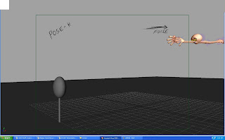
More definition with Secondary breakdowns and some "boundary walls":
Now start filling the blanks and the dead spaces! This is the period where your blocking starts looking like full animation. You define almost EVERYTHING here! You start to define all the eases, additional overlap/drag, micro anticipations, additional arc definition, overshoot, settle, etc... And this is the period where you add those subtle moves which brings all the life into everything. You start fleshing out your animation.
in the above pose we could clearly see that the effort the character is taking to really dive in to the poses this is called the anticipation for the anticipation its kinda manouvering the comp guy to force to get rid of dat inbetweens...
Timing (the King!):
Once I'm done with my key poses and secondary breakdowns, I've used GreasePencil to roughly time my animation, and then I manually moved all the keyframes to match its timing.Always remember to play with your timing! A good timing comes from experiment and experience!! The more you play with it, the better your results will turn out. And this is where MonkeyJam or Grease Pencil help me a lot. They allow me to play with my timing, quickly and efficiently.So, I timed all my drawings....and this is what I got
My last step in "stepped mode":
Converting into linear and starting to clean-up; Me: Hey dude... Maya! I want your in-betweens now! teeheeee... MAYA: YOU NUMSKULL! I offered you my cool in-betweens a long time ago, but you were acting too smart and declined my humble offer!! Oh well, here you go.... Me: Ummm....errrrr....errrr..errrr....okay!
I start cleaning up my animation as soon as I convert into linear tangents. Yes, clean-up!! You can't get away from clean up in CG..... And cleanup takes forever! Few months back, I remember I made one animation for a forum competition, and it turned out to be a crap! WHY???? Because I didn't clean it up the way I should have! The result was really poor, OOOHH!! (crying!!)..... You know, it really makes me CRINGE! So you can't get away with clean-up in CG, and thats what a lot of noob animators do as they're not sure of the importance of proper clean up! And no doubt I was one of them! heh....
Kill that ugly bump!!.....but wait! It could be your friend!:
I made up these equations, try to keep them in mind:
Bad animation + Good looking graph = Bad result! This will not do.
Bad animation + Bad looking graph = This really stinks!!(hellloooo Thanks!!)
It took some time and I cleaned up the graph editor. And after spending hours and hours fixing all the curves in the spaghetti box, this is what I got
Oh yeah! It takes a lot of time to do all this. But you need to do this in CG to make your stuff stand out!
After spending hours cleaning up in the linear mode, I convert everything into spline. And I start cleaning up my animation in spline. I've worked hard in the linear-pass clean-up. So, I need not to worry about this spline-pass clean-up.I open up my graph editor, and this time instead of moving those keyframes up and down I'll just adjust their tangents to clean them up. In the linear-pass, I've already made sure where all of my keyframes need to be. So most probably I'll not change their values this time and I'll just work on their tangents to make the graph and the motion look smooth.I may also delete a few extra keys. And that'll be just fine if that doesn't change the graph much. To do that efficiently you may wanna do this:In the graph editor in Maya, right click and and goto View-----> and check "Show Buffer Curves". Now select a keyframe and move it or delete a keyframe. You'll be able to see the original curve behind it! Its really handy when deleting those extra keyframes. Just make sure that deleting a keyframe is not changing the feel and flavor of your animation!
Ta-daa!
Thas all folks, i hope this thing helps you guys in some ways,well if u dont think so? just think that u have wasted couple of minutes in reading my work flow.......
GOOD BYE....
Special Thanks:I would really love to thank these good folks, if it weren't for them I could have never wrote my workflow tutorial....Keith Lango: For his awesome VTS. I've been learning everything from him. If it weren't for you Sir, I would've never even had the slightest idea of what animation really is!
Wednesday, September 30, 2009
imagination
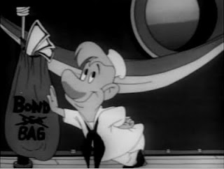 Here's the weirdest scene cut I've seen.
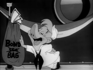
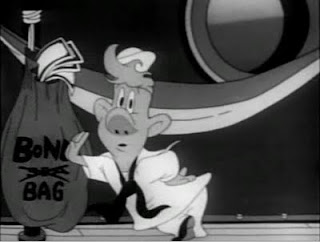
Before the cut Clampett anticipates that something weird is going to happen by having the bonds bag throb and shrink into infinity
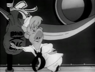
Then the hammock rolls up.
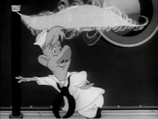
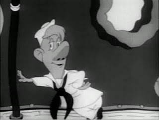
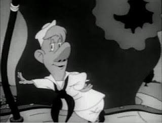
and then morph into a completely different scene, but Hook is still ther
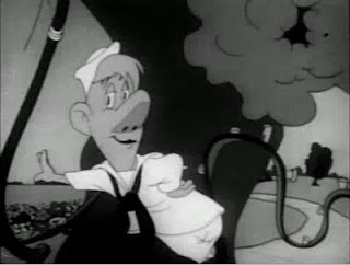
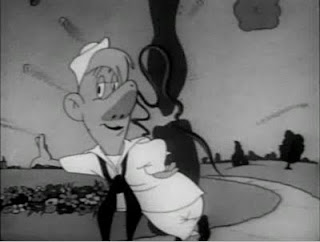
The WAY it morphs is really controlled and fun too - it isn't just inbetweened from one background to another as in many independent stoner animated films you see in animation festivals.
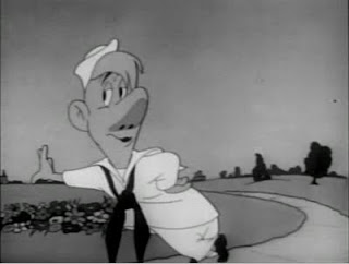
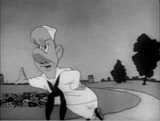
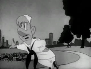
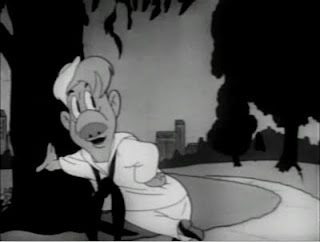
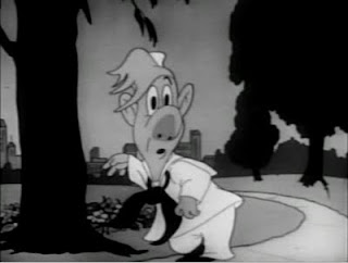
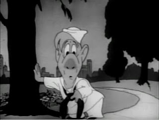
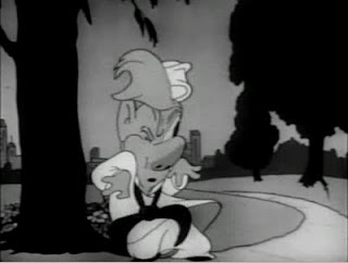
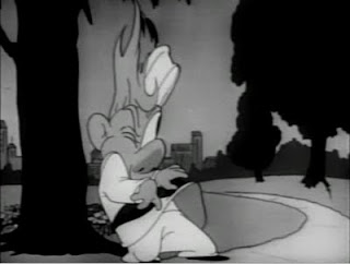
and then Hook's take when he discovers he is in a different place is amazing
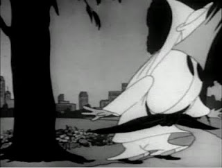
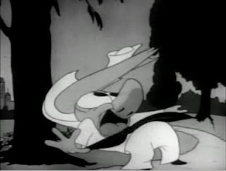
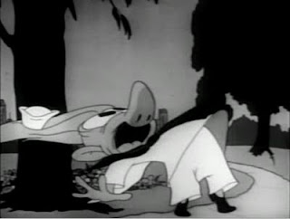
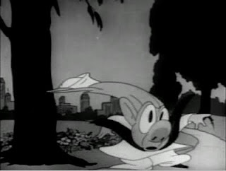
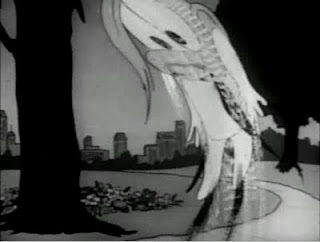
The 40s was a great time for experimentation and especially in the Clampett unit. Clampett would come up with crazy ideas out of nowhere and just try them - but them execute them so skillfully that they cause a really arresting visual effect that adds to the entertainment.http://www.cartoonthrills.org/blog/Clampett/45/Hook/ScribnerHook2.movThis scene leads to another series of genius cuts and accents that show just what a director can do in animation if he has skill, boldness and imagination. Almost any other director would have been just too cautious and conservative to take things to this level of imagination in so short a sequence. I'll post that later
Saturday, September 26, 2009
squiggling jhonny bravo
It's rough as heck, but it totally works. In fact, it more than works. It thrives on a level that is completely different than if it were tied down tight, tightly polished and had the holds all animated in like a typical 2d johnny bravo film. The rough look has a kind of vibrancy to it that actually adds to the film. I don't have a fancy explanation for how it works- I just know it does.
anyways i wanted to see Johnny in 3d cause i made it,i hope in more better way it should have been made,but tats all i can in those days


